Wednesday, May 30, 2012

The Green of This Notebook.


The Green of This Notebook. By John Divola. Nazraeli Press, 2008. 44 pp., illustrated throughout, 8x10". Limited edition of 500 numbered copies. Images from here.

Book description:

"John Divola’s 'The Green of this Notebook' is an artist’s book based on Jean-Paul Sartre’s 'Being and Nothingness' in which Sartre attempted, in the abstract, to define the essential character of existence - and in doing so, repeatedly referred to visual illustrations.

In 'The Green of this Notebook', Divola presents a series of related double pages. The images on the left are pages from Satre’s book with the visual references highlighted. On the right are photographs that have been made to correspond to the reference.

The book opens with the highlighted text "I am on a narrow path - without a guard rail - which goes along a precipice." with Divola’s corresponding photograph opposite.

The literal relationship of image/text combinations continues through out the book, ending with “If I eat pink cake, the taste of it is pink.”


Since 1975, John Divola’s work has been featured in more than fifty solo exhibitions in the United States, Japan, Europe, Mexico, and Australia and is included in such collections as The Museum of Modern Art, New York; the San Francisco Museum of Modern Art; Centre Pompidou, Paris; and the Victoria and Albert Museum, London."

Tuesday, May 29, 2012

Earth on Fire.


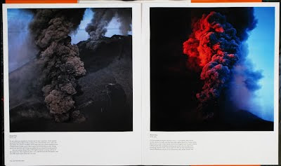
Earth on Fire. How Volcanos Shape Our Planet. By Bernhard Edmaier. Edited by Dr. Angelika Jung. Phaidon, 2009. 224 pp., illustrated throughout, 35x29,7cm. Images from here.

Book description:

"Spectacular images of the world's most beautiful and dramatic volcanic landscapes.

Bernhard Edmaier
(b.1957) trained as a civil engineer and geologist and has photographed the earth’s surface for over 15 years.

The result of meticulous planning and research, his extraordinary travels take him from the endless deserts of Africa to the ice plains of Iceland and the coral of the Great Barrier Reef.

His abstractly beautiful compositions offer an awe-inspiring view of our planet."

Thursday, May 24, 2012

Dirty Negative.


Dirty negative. By Jeremy Jansen. Éditions FP&CF. 40pp., illustrated throughout, 29,7x21cm. Limited and numbered edition of 200 copies.

I've only recently come across the work of artist Jeremy Jansen and I must say I really like it, I'm pretty curious to see even more. (More for you here, here and here also for example).


Book description:

" 'Dirty Negative' is a collection of photographs in the form of a 40 pages graphical exploration in black and white by Canadian artist, Jeremy Jansen.

Printed using a Risograph, these monochromatic pages allow the photographs to have a uniform consistency , creating a unique atmosphere to exist between the ink and staples.

This project was a year in reflection with the editorial line constantly evolving, standing round trips between the photographer and the editors.

In the end, 'Dirty Negative' echos an understanding of a singular universe. With borders of the mystical and the obscure placing the photographs into an abyss of abstract dialog."

Wednesday, May 23, 2012

Think A Lot Before Answering Any Question Next Thursday.


Think A Lot Before Answering Any Question Next Thursday. By Craig Atkinson. Café Royal Books, 2012. 30pp., illustrated throughout, 19x27cm. Numbered edition of 40 copies.

Book description:

"Collecting and using the bi-products of studio activity and daily life, I create a serial publication with new title each edition. Published to question the notion and role of the multiple, authenticity and reproducibility of ‘the book’.

Each edition is unique, the series being unified by binding, numbering and display mechanisms and parameters. The title for this edition came from a 'lucky' fortune cookie.

This publication is part of the Tate Gallery special collection."

Tuesday, May 22, 2012

Fun and Games.


Fun and Games. By Lisa Kereszi. Nazraeli Press, 2009. 72 pp., illustrated throughout, 14x12". Images from here.

Book description:

"The work in Lisa Kereszi's new monograph, titled after the name of a Jersey Shore arcade and the Ancient Roman wrestling phrase, 'It’s all fun and games, until someone loses an eye', documents the artist’s self-described obsession with what is hidden behind the facades of strip clubs, haunted houses, nightclubs, bars, and other places of fantasy and entertainment.

'I look for places where fantasy falls short upon closer inspection', Kereszi says. 'When you look at a nocturnal place in the light of day, it looks strange and uncanny. Reality becomes surreal. I look at those banal details that I find (a rip or tear, some dirt, a crack) with a documentary, deadpan view, but colored with emotion and desire and a longing for something beyond'.

Kereszi’s images are devoid of participants, allowing the viewer to look at what people discard or reject, or are in denial about, and focus on that.

Lisa Kereszi’s work is included in the permanent collections of the Whitney Museum of American Art, New York; the Brooklyn Museum of Art; and the Study Collection of the Museum of Modern Art, New York."
Saturday, May 19, 2012

Greenhouse Studies.


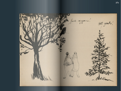
Greenhouse Studies. By Philippe Weisbecker. Nieves, 2012. 32pp., illustrated throughout, 16x22,5 cm.

This is a really beautiful, low-fi book - poetic in its quietness and simplicity.


Book description:

"Born in 1942, Weisbecker studied interior design in Paris. By 1968 he moved to New York. First working as a draftsman in an architectural firm, he started a career as an illustrator at the age of 30. His work has been published in major American publications such as the New York Times, Time magazine and The New Yorker among others.

In the late 90's he shifted gradually from commissioned work to his own original production which he is now showing in galleries worldwide. Moving back to France in 2006, he is now sharing his time between Paris and Barcelona.

In essence, Weisbecker's art consist of depicting elements of our daily life untouched by the sometime devastating effects of fashion's changing mood. These range from tools to appliances, from industrial buildings to public housing and, in the present case, greenhouses.

Greenhouses were created for the purpose of preserving an inner world from the outside world. they haven't changed much over time. Their purpose created their form. There lies their eternal beauty. It is this beauty that Weisbecker invites us to share with him through his Greenhouses study book."

Friday, May 18, 2012

Because her Beauty is Raw and Wild.


Because her Beauty is Raw and Wild. By Klaus Born, Valentin Hauri and Oliver Krähenbühl. Nieves, 2008. 42pp., illustrated throughout, 20x26cm.

Book description:

"The joint publication of Klaus Born, Valentin Hauri and Oliver Krähenbühl hosts three different ‘generations’ of painters and exposes three unique artistic approaches.

Such a combination seduces us into comparative reflections, since inevitably the viewer explores and compares differences and similarities between the artists’ articulations, while also probing individual characteristics and approaches.

Their works are broadly non-figurative - something they ‘superficially’ share - and in each case the artist’s paintings are supplemented by drawings and other works on paper. The venue offers an opportunity to study from a neutral angle - side by side - their individual approaches and themes; it provides a gateway to evaluate distinct aspects of an artistic stance in parallel positions.

The selected works in juxtaposition sharpen the profiles of these individual positions and turn one’s attention to elements and features of and within the artistic process which accordingly - reinforced by a differentiated perception - discloses these features more accurately

Published on the occasion of the exhibition 'Because her Beauty is Raw and Wild' at oxyd, Winterthur."

Wednesday, May 16, 2012

The City.


The City. By Andreas Schmidt. Hatje Cantz, 2009. 144 pp., illustrated throughout, 29,4x25cm. Images from here.

Book description:

"Andreas Schmidt (*1967) captures clear-sighted images on his nighttime rambles through the City of London - the historical heart of the city and one of the world’s financial centers.

As was the case in his photobook 'Las Vegas', which dealt with another glittering, superficial world, here he also documents the seductive glamour of urban financial palaces while never losing sight of their inhuman exorbitance.

Although hundreds of thousands of people work in the City, its dimensions are not human. Everything is oversized, made of steel, glass, and marble, and decorated with mindless ornamental elements. Only emergency exits or indoor plants are of normal size, and they look absurd next to everything else. Empty lobbies, conference rooms, and endless corridors conform to corporate design, but primarily emanate power and coldness.

As the cover of the book attests, the venerable Bank of England long ago began fitting itself out with enormous grandeur: the Neoclassical façade by Sir John Soane (1828) was regarded as an insurmountable barrier for unauthorized persons."

Tuesday, May 15, 2012

Nothing and Everything.


Nothing and Everything. Numerous contributing artists. Fraenkel Gallery, 2006. 46 pp., illustrated throughout, 8x10". Images from here.

Book description:

" 'Nothing and Everything', is a hardcover catalog that accompanies an exhibition of thirty-eight drawings, paintings, photographs, and sculpture spanning eleven decades.

The book and exhibition includes works by Carl Andre, Vija Celmins, Jean Debuffet, Walker Evan, Robert Gober, Peter Hujar, Donald Judd, Ellsworth Kely, Helen Levitt, Piero Manzoni, Agnes Martin, Robert Rauschenberg, and Hiroshi Sugimoto, among others.


'Nothing and Everything' investigates one of art’s oldest mysteries: how an artwork may simultaneously contain elements of emptiness and fullness, void and profusion.

These qualities may appear contradictory but they do not have to be so.

Several works, including Peter Hujar’s 1975 photograph of the Hudson River and Ellsworth Kelly’s drawing Light Reflecting on Water (1950), explore connections between the banal and the sublime, particularly in nature. Diane Arbus’s photograph Clouds on a Screen at a Drive-in, N.J. (1960), for example, blurs the line between the mundane and the transcendent with its image of a billowing cloud on the movie screen against the evening sky.

More than a statement of modern man’s distance from nature, the photograph captures a moment of the sublime bounded by the everyday."

Monday, May 14, 2012

Speak to Me.


Speak to Me. By Stefan Heyne. Texts by Hubertus von Amelunxen, Stefan Gronert, Karen Irvine, Maren Polte. Interview with the artist by Timothy Persons. Graphic design by Marc Naroska. Hatje Cantz, 2012. 72 pp., illustrated throughout, 30,9x38,3cm. Images from here.

Book description:

"To this day, German photography remains influenced by the New Objectivity of the Becher School and its protagonists, such as Andreas Gursky, Candida Höfer, Thomas Ruff, and Jörg Sasse.

In an attempt to oppose the classic aspects of the photographic image - sharpness and recognizability - Stefan Heyne (*1965 in Brandenburg an der Havel) leaves the objects in his pictures in a state of uncertainty, resisting the usual observational parameters.

Faint traces of things appear in the light, only to disappear again in the contiguous darkness.

This publication features Heyne’s most recent works, to date the most radical abstractions in his oeuvre, which show photography in a manner commensurate with its etymology - as 'painting with light', liberated from the belief in the objective reproduction of reality as it is inscribed in the medium to this day, one that continues to adhere to Enlightenment concepts."

Wednesday, May 09, 2012

The Day in Its Color.


The Day in Its Color. Charles Cushman's Photographic Journey Through a Vanishing America. By Charles Cushman, text by Eric Sandweiss. Oxford University Press USA, 2012. 240 pp., illustrated throughout, 7x9". Images from here.

UPDATE:
Don't miss the archive at Indiana University - slides by year, location, subject, genre + a biography/contextual information and the notebooks where Charles Cushman noted down what he'd just captured (it's pretty wonderful).


Book description:

"Charles Cushman (1896-1972) photographed a disappearing world in living color. Cushman's midcentury America - a place normally seen only through a scrim of gray - reveals itself as a place as vivid and real as the view through our window.

'The Day in Its Color' introduces readers to Cushman's extraordinary work, a recently unearthed archive of photographs that is the largest known body of early color photographs by a single photographer, 14,500 in all, most shot on vivid, color-saturated Kodachrome stock.

From 1938-1969, Cushman - a sometime businessman and amateur photographer with an uncanny eye for everyday detail - travelled constantly, shooting everything he encountered as he ventured from New York to New Orleans, Chicago to San Francisco, and everywhere in between.

His photos include portraits, ethnographic studies, agricultural and industrial landscapes, movie sets and media events, children playing, laborers working, and thousands of street scenes, all precisely documented in time and place. The result is a chronicle of an era almost never seen, or even envisioned, in color.

This well-preserved collection is all the more remarkable for having gone undiscovered for decades. What makes the photos most valuable, however, is the wide range of subjects, landscapes, and moods it captures - snapshots of a lost America as yet untouched by a homogenizing overlay of interstate highways, urban renewal, chain stores, and suburban development - a world of hand-painted signs, state fairs, ramshackle shops, small town living and bustling urban scenes.

The book also reveals the fascinating and startling life story of the man who stood, unseen, on the other side of the lens, surely one of America's most impressive amateur photographers and outsider artists.

With over 150 gorgeous color prints, 'The Day in Its Color' gives us one of the most evocative visual histories of mid-20th century America that we have."

Tuesday, May 08, 2012

No Hay Nadie/There Is No One.


No Hay Nadie/There Is No One. By Graciela Iturbide. La Fabrica, 2011. 68 pp., illustrated throughout, 24x29 cm.

I really like the work of Graciela Iturbide and have previously featured this, this, this, this and this book with her work.


Book description:

" 'No hay nadie' ('There is No One'), by the Mexican photographer Graciela Iturbide, collects 25 images shot in India between 1997 and 2010 before the inauguration of her individual show in the salon gatherings at Arles.

Itburbide is one of the most compelling photographers in Latin America. Her oeuvre has been recognized internationally, and she has shown her work in the most important arts centers around the world.

The photographs, in black and white, have been taken in cities like Benares, Bombay, and Calcutta, and in them Iturbide’s artistic signature is manifest, characterized by its exceptional force and visual beauty as well as a photographic style centered on an interest in culture, rituals, and daily life.

In the photographs of 'No Hay Nadie', in which individual people are always absent, one can appreciate the documentary ethos and sensibility of the artist herself, in which she lays bare the relationship between man and nature, individual and culture, the real and the psychological.

The book contains a previously unpublished text by Óscar Pjol, director of the Cervantes Institute in New Delhi, called Las apariencias engañan (Appearances Deceive), in which he reflects on the notion of eternity."

Monday, May 07, 2012

Waldersten 365.


Waldersten 365. By Jesper Waldersten. Max Ström, 2011. 672pp., illustrated throughout, 13,1x19,4cm. Click here to purchase so part of the sale goes to Save the Children.

I liked Jesper Waldersten's exhibition at Grafikens Hus - it really felt like his illustrations reached another level with the immersion in printing techniques (the exhibition was the culmination of a collaboration between Jesper Waldersten and musician Martin Sköld, with Waldersten spending time in Grafikens Hus' print workshop in close collaboration with printer Siv Johansson).

I appreciated this book even more as an extension of seeing the exhibition (even though it is of course a completely different project).

I always like the one illustration a day premise (sometimes that gets stale, but not in this instance), and the exposed binding in red thread as spine is a really wonderful thing to see on a fairly mass-market kind of book.


Book description:

"Every day for a whole year has Jesper Waldersten created at least one unique image and added the piece at www.waldersten365.com. He has a wide range and moves between dark humor, sharp contemporary commentary and clever wordplay."

Wednesday, May 02, 2012

Le Retour a La Raison


Le Retour a La Raison (1923) by Man Ray (found via Lay Flat's twitter).

I really like this short film made by Man Ray in 1923. It's considered one of the first Dadaist films made.

Description:

"Man Ray, an avant-garde artist known for his innovative work in photography, has made in this film a series of visual and kinetic experiments in the cinematic form.

Weaving abstract and concrete images, positive and negative exposures, static and moving objects, Ray creates a catalog of techniques - including his own 'rayographs', cameraless contact prints of objects on paper and film - that later filmmakers working in the experimental genre would explore and define."

Tuesday, May 01, 2012

Every TV Needs a Revolution.


Every TV Needs a Revolution. By Dara Birnbaum. Imschoot, 1993. 112 pp., illustrated throughout, 14,8x21 cm. Edition of 1000 copies.

To those people who originated these anonymous street posters, May '68 Paris. [dedication page]

Book description:

"Using video editing techniques, Dara Birnbaum activates static images of anonymous street posters and graffiti from the student uprisings of May '68 and puts their strong graphic elements in the service of her own contemporary cultural critique.

The electronically cropped, rotated and inverted images are re-dedicated to the printed page as commentary on the public space of television and mass media."