Tuesday, July 12, 2011

Films.


Films. Photographs by Paul Graham. MACK books, 2011. 64 pp., illustrated throughout, 24x32cm. Images from photo-eye.

A beautiful premise.

Book description:

" 'Films' is Paul Graham's eulogy to the physical material of photography: Film.

The 20th century's greatest medium has undergone a catastrophic decline over the past decade as digital cameras have swept aside the traditional process of taking photographs.

Film has died: Kodacolor, Fujicolor, Tri-X, Kodachrome, Ektacolor - all evocative names for any photographer - are now gone or fading fast. Yet this magical material is a true product of both science: silver salts suspended in gelatin emulsion on celluloid base, and magical alchemy: it could capture light. Film became the defining material of 20th century creativity, and is ubiquitous to every great artist of photography and film making.

While examining his past 30 years of work for the 2009 survey exhibition and book, Graham became enamoured with the material of his craft, and began to reflect upon the physical substance by which he, and all photographers, made their images.

Besides scanning his images for the survey, he also scanned the blank film ends and unexposed frames from each body of work to gather an alternative survey, a 'negative retrospective' of his practice. What first appears to be abstract dots, blobs or colour forms, are in fact just greatly magnified images of the raw film emulsion - the color dyes clouds formed in the exposure and development of film.

These images are not abstract at all, but extreme close-ups of the film's structure - the red, green and blue dyes that form film emulsion, which comprise each and every celluloid image in existence. Their beauteous complication, the wonder of their granular form, irrespective of what they describe, is given here for us to enjoy.


Graham presents us a timely tribute to the passing of film. The grains, color dyes and black and white crystals, make images of beauty, simplicity and scientific record.

Part wistful homage, part farewell, part visual wonder, 'Films' is a book for anyone who engaged with photographic material in the 20th century."

Saturday, July 09, 2011

Desire for Magic.


Desire for Magic. Patrick Nagatani 1978-2008. Photographs by Patrick Nagatani. Edited by Michele M. Penhall. University of New Mexico Art Museum/University of New Mexico Press, Albuquerque, 2010. 260 pp., illustrated throughout, 12x12". Images from photo-eye.

'Desire for Magic' was published to accompany the retrospective exhibition of the work of photographer Patrick Nagatani at the University of New Mexico Art Museum.


Book description:

"The monograph includes seven critical essays in which each author addresses a specific campaign; a comprehensive bibliography and exhibition history; and previously unpublished texts significant to particular projects.

The essays were written by a diverse and distinguished group of scholars that includes Barbara Hitchcock, the Director of Cultural Affairs at the Polaroid Corporation where Nagatani completed some of his first large scale Polaroid works, Dr. Marie Antonella Pelizzari, former Associate Curator of Photography at the Canadian Center for Architecture, and Dr. Kirsten Buick, Associate Professor of Art History at the University of New Mexico who presents a critique of Nagatani's Tape-estries, a series he began in the 1980s, but work that is rarely exhibited or discussed."

Wednesday, July 06, 2011

Cy Twombly: Catalogue Raisonne. Paintings 1996-2007.


Cy Twombly: Catalogue Raisonne. Paintings 1996-2007. By Cy Twombly and Heiner Bastian. Museum of Modern Art, 2008. 200pp., illustrated throughout, 12,25 x 10,75".

I was saddened to learn that the great artist, painter and sculptor Cy Twombly has passed away at the age of 83 (read more here, here and here for example) - rest in peace.

The Moderna Museet exhibition of his work this autumn (which I've been very much looking forward to) will be a treat and tribute indeed.


Book description:

"Cy Twombly's oeuvre featuring paintings, sculptures, works on paper and photographs displays a highly personal, literary character, but has undergone several profound transformations.

The most decisive was the contact with Mediterranean culture caused by Twombly's with drawal from the New York art scene - he moved to Italy in 1957.

Greek gods, the Mediterranean light, Western history, literature and mythology all found their way into his art. In ever larger canvases he presents the drama of humanity as a sensuous and poetic vision of color, drawing and writing."


I've previously also featured the book Cy Twombly: Photographs 1951-2007 with Twombly's work.

Tuesday, July 05, 2011

Petites machines à images.


Petites machines à images. Photographs by Laurent Millet. Text by Francois Seigneur. Filigranes Editions, 2008. 96 pp., 50 duotone photos, 30,5 x 24cm. Images from photo-eye.

A truly magical monograph by the French artist and photographer Laurent Miller.

Book description:

"This monograph is a collection of small buildings from crops poaching fun items without qualities, pieces of cardboard decorated with materials pétaradantes, son of rusty iron, and sometimes surfaces s'agrémentent paperwork, plans, diagrams hermetic supposed to inform their design.

The horizon of a flat Wednesday and said the oil leak and thwarts a notion of perspective too ingrained in our plastic stereotypes. Laurent Millet reinvents in his compositions, the status of landscape or scenery or subject, but both simultaneously.

Cultivating the art of calotype*, breaking up photography, using complex blends of negative practice is between staging and photos are not posed. Laurent Millet lived in landscapes where water, earth and the sky merge on the banks of the Gironde estuary where he made his territory."


View a video of the entire book here.


* The calotype is a photographic process invented by William Henry Fox Talbot in 1841. It provides a direct negative paper and thus be able to reproduce positive images by simply drawing contact.

Monday, July 04, 2011

México Roma.


México Roma. Photographs by Graciela Iturbide. RM, 2011. 96 pp., 50 illustrations, 6½x8¼".

I really like the work of artist and photographer Graciela Iturbide, and have previously featured the books Graciela Iturbide, El Baño De Frida and Juchitan de Las Mujeres. 1979-1989.


Book description:

" 'México-Roma' is an eclectic book unified by a single guiding thread: the vision of Graciela Iturbide. It consists of images of objects taken in Mexico City between 1974 and 2009 and in Rome in 2007, during the photographer’s stay as a guest of the Festival Internazionale di Roma.

The origin of the book goes back to the exhibition presented in the Museo Archivo de la Fotografía (MAF) in Mexico City in 2009.

This publication, which has gone through all manner of vicissitudes, and of which only a few copies have been 'salvaged', gathers mostly unpublished images of the Mexican and Italian capitals.

It has been produced with modest means and published with the support of numerous individuals and institutions. The title was hand-written by Graciela herself on labels she bought in Bolivia."


A limited edition (50 copies only) of 'México Roma' is available. It's signed and numbered by the author and comes in a handmade clamshell box, together with an original 5 x 7" photograph printed on silver gelatin.

Friday, July 01, 2011

Color Coordinated Interiors 1983.


Color Coordinated Interiors 1983. Photographs by Laurie Simmons. Interview by James Welling. Skarstedt Fine Art, New York, 2007. 56 pp., 21 colour illustrations, 8x10". Images from photo-eye.

Settings-wise this reminds me very much of an excellent book from 1984 that I got at the flea market the other day. I very much like what Laurie Simmons has achieved with this work.


Book description:

" 'Color Coordinated Interior' catalogues a little known but characteristic and illuminating early project of Laurie Simmons's, from 1983, just a few years after her first solo show in New York.

Simmons is best known for her chilling and sophisticated photographs of dolls and dollhouses - seminal works that can be found in the greatest collections of contemporary art throughout the world, including The Metropolitan Museum of Art and the Guggenheim Museum in New York.

Here, Simmons created miniature spaces using projection and illusion rather than glue-and-board craft, casting photographs behind dolls and lighting her tiny models starkly with flashlights - they're 'Teenettes', three-inch-high Japanese figures whose clothes and hairstyles are all molded from the same single piece of brightly-colored plastic. The Teenettes' features are fuzzy by nature, but the scenes behind them here are photographed so that piping on every pillow pops out.

This guided tour, with an interview by California artist James Welling, puts this newly collected work in context."

Tuesday, June 28, 2011

Black and Blue.


Black and Blue. Photographs by Morten Andersen. Text by Dorota Sacha-Krol. Shadowlab, 2011. 288 pp., illustrated throughout, 18x24cm. Limited edition of 600. Images from photo-eye.

Book description:

"As Knut Hamsun says in his classic novel 'Hunger' about Oslo «the city no one escapes from until it has left his marks on him...», the same can be said about today's Oslo in Andersen's books and in 'Black and Blue' almost literary...

In his 12th photobook Morten Andersen revisits his sold out books 'Fast City' and 'Oslo F.' and mix photos from these two with unpublished ones and a few from last years 'Color F.' as well."


I've previously featured the books Jetlag and Alcohol and Fast City by Morten Andersen.

Monday, June 27, 2011

Not Seen | Not Said, With Wes Mills. Orchard Volume Two.


Not Seen | Not Said, With Wes Mills. Orchard Volume Two. By Raymond Meeks, with Wes Mills. Silas Finch, 2011. Images from photo-eye.

Orchard is a series of collaborative journals by Raymond Meeks (the two editions so far are excellent!)

Book description:

" 'Not Seen | Not Said, with Wes Mills', continues our commitment to produce artist-driven editions that merge exceptional content with considered design.

This collaborative journal combines Ray's photographs with 14 reproductions of drawings by Mills, which are tipped in to the book's pages.

Made by hand in Portland, OR, the book also features three photographic tip-ins, and a remarkable front cover constructed from a silver halide transparency."


Read and see more from Raymond Meeks here, and about the limited editions of ' Not Seen | Not Said, With Wes Mills. Orchard Volume Two' here.

Sunday, June 26, 2011

Rest in Peace Peter Falk


Truly saddened to learn that Peter Falk passed away on Friday evening at the age of 83.

Yesterday was spent Columbo box set-watching in homage - his performances will always be a joy to watch.

Read more here, here, here, here, here for example.

Friday, June 24, 2011

Happy Midsummer!


Midsummer pole / maypole.

Happy Midsummer!

Today is an especially exciting day since it's the first Midsummer for one family member ♥

To learn more about the Swedish Midsummer traditions continue reading or go here or here for example. Hope you have a wonderful day!

"In modern Sweden, Midsummer's Eve and Midsummer's Day (Midsommarafton and Midsommardagen) [...] is arguably the most important holiday of the year, and one of the most uniquely Swedish in the way it is celebrated, even if it has been influenced by other countries long ago.

The main celebrations take place on the Friday, and the traditional events include raising and dancing around a huge maypole. One typical dance is the frog dance. Before the maypole is raised, greens and flowers are collected and used to cover the entire pole.

Raising and dancing around a maypole (majstång or midsommarstång) is an activity that attracts families and many others. People dancing around the pole listen to traditional music and many wear traditional folk costumes. The year's first potatoes, pickled herring, sour cream, and possibly the first strawberries of the season are on the menu. Drinking songs are also important at this feast, and many drink heavily.

Because Midsummer was thought to be one of the times of the year when magic was strongest, it was considered a good night to perform rituals to look into the future. Traditionally, young people pick bouquets of seven or nine different flowers and put them under their pillow in the hope of dreaming about their future spouse. In the past it was believed that herbs picked at Midsummer were highly potent, and water from springs could bring good health. Greenery placed over houses and barns were supposed to bring good fortune and health to people and livestock; this old tradition of decorating with greens continues, even though most don't take it seriously."

Thursday, June 23, 2011

Paradise/Paradox.


Paradise/Paradox. Photographs by Tom Fischer. Legends Publishing, 2009. 108 pp., 61 black & white illustrations, 12¼x9¼". Images from photo-eye.

Book description:

"This collection of sixty-one photographs includes images of places that are revered for their perfection of form, historic cultural landscapes, and views of paradise lost. Tom Fischer has envisioned each with the greatest of care in hopes of finding beauty in truth.

Through his pictures and essays Fischer presents us with a great paradox of modern life: that the driving human desire to find paradise often leads to the destruction of the place we love the most. Thousands of tourists visiting a place like the Yosemite Valley alters it to such a degree that it is no longer paradise. Our recognition that we can't achieve utopian experience has led to everything from theme parks to the private gardens of the wealthy. For many, the afterlife is the only hope of paradise.

Fischer acknowledges that the earth's processes are so complex that it is next to impossible to tell if our attempts to save the planet are a gift of a curse. Recognizing this has led him to assume the role of observer rather than theorist in his studies of the land. Those seeking answers to the pressing environmental questions of the day will not find them in the writings of this author of the images in this book, but it is possible that they will identify some useful questions."
Wednesday, June 22, 2011

Winter.


Winter. Photographs by Jeffrey Conley. Nazraeli Press, Portland, 2011. 64 pp., 42 duotone illustrations, 12x13". Images from photo-eye.

I love the Swedish summer, and it is such a sunshine day today, but these images and their texture, mood, colour palette (or lack thereof) and graphic, quiet nature felt really inspiring to me (which I guess they probably wouldn't if it was deepest darkest winter).


Book description:

"Jeffrey Conley's gorgeous first monograph, which takes its name from its primary subject, comprises a selection of 42 images of the essence of 'Winter'.

Known for his meticulously crafted black and white prints, which have been widely exhibited and collected in the United States and abroad, Conley lives and works in the Willamette Valley of Oregon."

Tuesday, June 21, 2011

The Birthday Party.


The Birthday Party. Photographs by Vee Speers. Dewi Lewis Publishing, 2009. 96 pp., 44 colour illustrations, 33x22,7cm. Images from photo-eye.

It's my birthday!

Book description:

"This is a series of portraits of children about to attend an imaginary birthday party. Inspired by her daughter’s birthday party Speers imagined what characters might be created if role play were pushed to imaginative extremes.

The children are placed in front of the same white wall and gaze into the lens of the camera, performing within a strictly laid out frame. They reveal very little of themselves and yet this is what makes the portraits so magnetic.

The childlike game of dressing up, of putting on costumes, reinforces the surreal tone of the series.


For the past fifteen years Vee Speers has been based in Paris, working in fashion, photojournalism and fine art photography.

Widely exhibited throughout Europe, the United States, Brazil, Mexico, Japan and Australia, her work has also been seen in publications including The Sunday Times, Harpers+Queen, GQ, Arena and Esquire."

Friday, June 17, 2011

Cool Designs without illustrations.


Cool Designs without illustrations. PIE Books, 2011. 192pp., colour illustrations throughout, 30,6×12cm.

A sweetly-named (albeit not quite accurately titled) book filled of designs made up of geometric shapes, colour-blocking, typography, graphic design, etc.

Thursday, June 16, 2011

Dune.


Dune. By Misha de Ridder. Lay Flat, 2011. 32 pp., illustrated throughout, 9,5x11,5". Limited edition of 750 copies.

Beautiful, poetic and dreamlike landscape photographs by Misha de Ridder in this artist book published by the excellent Lay Flat.

Book description:

"Somewhere in densely populated Holland exists a twilight zone where it is possible to travel in time: a small strip of dunes separating polder and sea, just a twenty minute drive from the city of Amsterdam.

In 'Dune', Misha de Ridder unveils natural scenes so estranged and mysterious that they could be described as unreal realities.

Lushly presented in this limited-edition artist book, De Ridder’s precise and highly detailed photographs call to mind Dutch landscape paintings of the 17th century and Romantic Era. In the barren and tormented nature of the dunes, it is light, color and atmosphere that salvage the memory of a wilderness lost."


There's also a special edition of 'Dune' available (limited to 20 copies). It includes an archival 9,5 x 11,5" colour print, and is signed and numbered by the artist.

Wednesday, June 15, 2011

Un Homme de Têtes


Un Homme de Têtes by Georges Méliès (1898). Source.

I find myself very interested in and inspired by analogue things at the moment, and thought this excellent documentary was an inspiration (I'm sorry if you can't view it in your country, if so further info here).

Above is the short film 'Un Homme de Têtes' from 1898 by French filmmaker and innovator Georges Méliès - a film generally seen as a masterpiece of the era.


Description:

"A conjurer removes his head and places it on a table. Instantly, he grows a second head, identical to the first. As the head on the table looks around, the conjurer crawls under the table to show this is no sleight of hand. He then removes his new head and places it on the table next to the first head, and again grows another. This third head he removes and places on a second table, before growing a fourth. The conjurer produces a banjo and begins to sing with his three detached heads. Losing his patience, the conjurer smashes the three detached heads with his banjo, before exiting with a bow. "

Monday, June 13, 2011

Fantasmagorie


Fantasmagorie by Émile Cohl (1908). Source.

Émile Cohl (1857-1938) was a French caricaturist of the now largely forgotten Incoherent Movement, as well as a cartoonist and animator.

Cohl made the film 'Fantasmagorie' between February to May or June 1908, and it was released on August 17, 1908. It's considered the first fully animated film ever made.

"It was made up of 700 drawings, each of which was double-exposed (animated 'on twos'), leading to a running time of almost two minutes. Despite the short running time, the piece was packed with material devised in a 'stream of consciousness' style.

It borrowed from Blackton in using a 'chalk-line effect' (filming black lines on white paper, then reversing the negative to make it look like white chalk on a black chalkboard), having the main character drawn by the artist's hand on camera, and the main characters of a clown and a gentleman (this taken from Blackton's 'Humorous Phases of Funny Faces').

The film, in all of its wild transformations, is a direct tribute to the by-then forgotten Incoherent movement. The title is a reference to the 'fantasmograph', a mid-Nineteenth Century variant of the magic lantern that projected ghostly images that floated across the walls."


Quote from here.

Friday, June 10, 2011

Vintage Patterns of Japan.


Vintage Patterns of Japan. PIE Books, 2011. 192pp., colour illustrations throughout, 21×14,8cm.

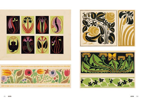
Some really wonderful prints and pattern design from 1910-1930s Japan (and to my Western eyes slightly unexpected in parts for being the 1910-30s, which feels really interesting).

Book description:

"This book is a collection of beautiful patterns from Taisho and early Showa era (1910s-1930s), when the life of women has dramatically changed.

Focusing on the items that appealed to Japanese girls at that time, such as illustrated envelopes of woodblock printed flowers and plants, package of sweets and cosmetics influenced by art nouveau and art deco, these vintage patterns symbolize the culture of Japanese girls at that time, who longed for western culture.

Addition to the patterns used on the products, patterns from a pattern collection by popular designers at that time will be also included."

Thursday, June 09, 2011

Fertile Geometry.


Fertile Geometry. Photographs by David Pollock. Edited and designed by Urbanautica. Introductions by David Pollock, Andrea Filippin and David R. Montgomery. Punto Marte, 2011. 64 pp., 30 colour illustrations, 28x28cm. Images from photo-eye.

Book description:

"Over a two year period, David Pollock photographed the farm fields of Saanich Peninsula on Southern Vancouver Island , Canada.

The photographs often place us within a deep open space with a vantage point that directs our vision to the soil and presents the farm topography as a palimpsest upon which we discern the traces of farm work.

They speak to us of the remnants of human actions in this landscape and situate us within a continuum of constant interaction with the natural world that is both physical and symbolic."

Wednesday, June 08, 2011

V&A Pattern: Spitalfields Silks.


V&A Pattern: Spitalfields Silks. By Moira Thunder. Victoria & Albert Museum and Har/Cdr edition, 2011. 80pp., 65 colour illustrations, 18,3 x 13,5cm.

V&A's Pattern-series is truly wonderful, and I especially love this edition showcasing eighteen-century patterns originated in London.

It's edited by the curator of design in the Word and Image Department at the V&A.


Book description:

"This beautiful series reveals the V&A’s spectacular and extensive pattern collections. Available separately – as well as in a collectors’ slipcase edition – the latest titles are Chinese Textiles, Spitalfields Silks, Pop Patterns, and Walter Crane (published in 2011).

'Spitfields Silks' displays delightful floral designs alongside quirky, strikingly modern silks, all produced in eighteenth-century London."

Monday, June 06, 2011

Patti Smith - Dream of life


Clip from 'Patti Smith - Dream of life'. Documentary shown on the K-Special culture program (in English with Swedish subtitles). View the entire documentary here.

Today is Sweden's National Day, so instead of being a plain old Monday it's a day off (yay!).

I thought we'd celebrate this with the brilliant Patti Smith documentary Dream of Life (also watch this great one hour interview with Patti Smith and filmmaker Steven Sebring).

Patti Smith is also one of 2011's recipients of the Swedish Polar Prize, which you can read more about here, here and here for example.

Friday, June 03, 2011

Lose My Number.


Lose My Number. Photographs by iO Tillett Wright. Foreword by Diego Cortez. Pau Wau Publications, 2011. 72 pp., black & white illustrations, 7x9". Images from photo-eye.

The book 'Lose My Number' by artist, photographer, writer and filmmaker iO Tillett Wright was published to accompany the exhibition BREEDINGS at Fuse Gallery, New York.

View the entire book here (video).


Book description:

"Opposing nothing, iO Tillett Wright's political activity is covert. Social definitions are exposed, explored, traded, discarded... Gender, race, sexuality - nothing is black & white here.

The subjects of iO's pictures are not marginal... They are central..., but most importantly, like the photographer herself, they are fluid, dynamic, beyond labeling (post-existential), they cleave and share identities, i.e, they are alive.

In the images of 'Lose My Number', intimacy is paramount... ...Nothing is staged, and there is no separation between life and art."